RUBBER
RUBBER
She had warned him she wouldn’t be home till late, but he had said to wake him anyway to kiss him good-night. She didn’t, though. She tiptoed down the back steps to her room. Belatedly she felt guilty for breaking her promise. But now she was in her nightgown and had no way to get in the back door.
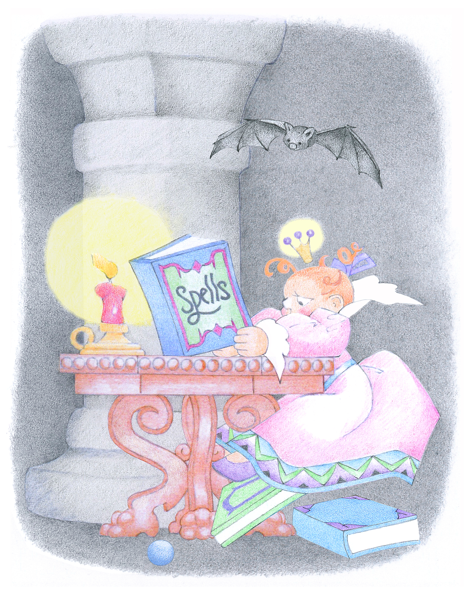
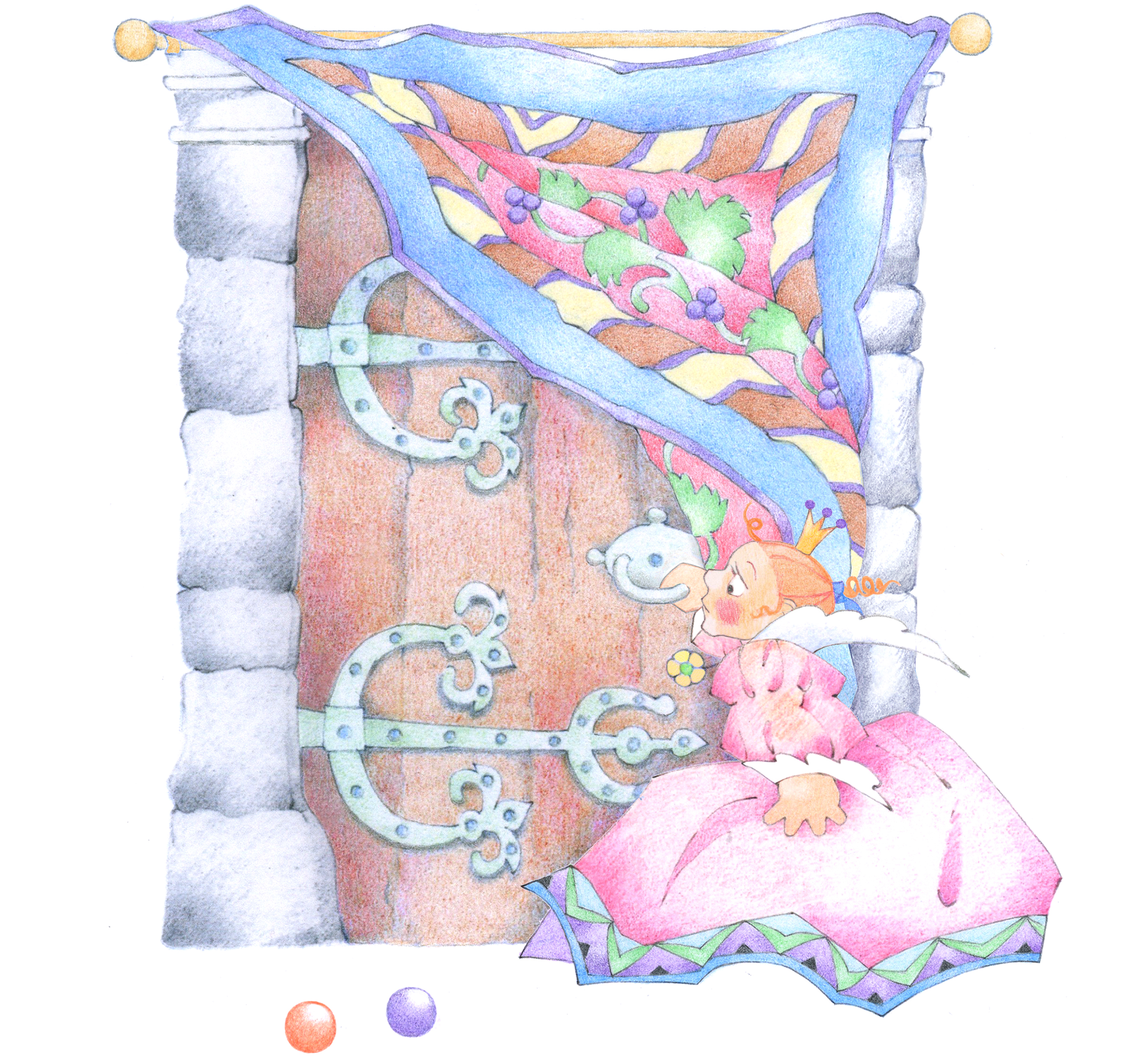
So she pulled her wooly car coat over her shoulders, hoisted the hem of her nightgown, and stumbled up the dark, soggy path around the side of the house under a light pattering rain. The eery creaking of the tall bushes around her made her shudder. Zeke had forgotten to turn on the porch light, so she had to fumble for some time with her keys to get the front door open.
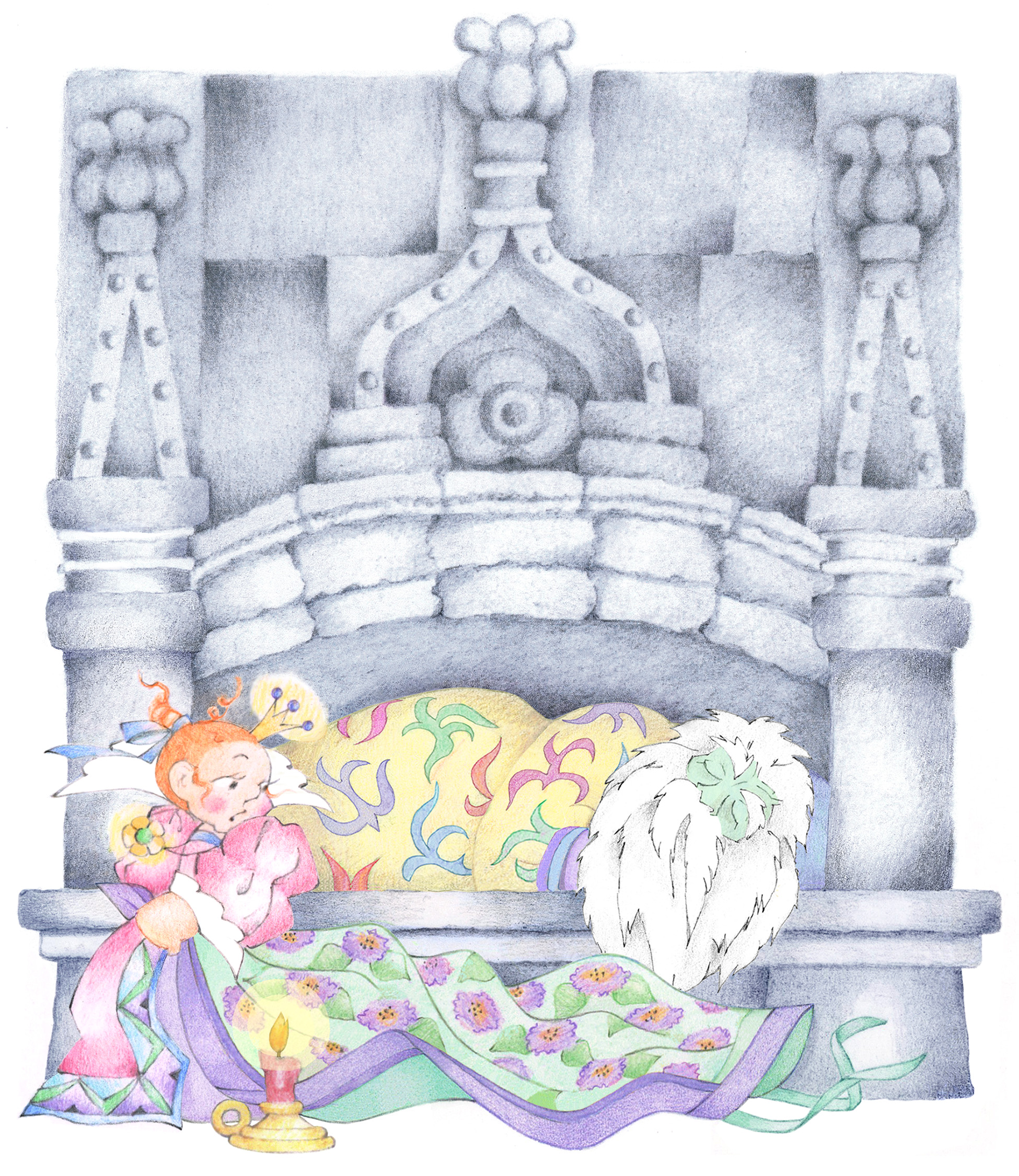
When she lay down beside him, he didn’t wake up. The bed shook as though there were earth tremors as Franny tossed against it in her sleep.
“Zeke?” she whispered. He didn’t stir. She called his name again.
“You’re supposed to kiss me to wake me up,” he mumbled. “That’s how it goes in fairy tales.” And he pooched out his mouth ridiculously. Instead she leaned over him, blowing softly into his face, then bit his chin.
“Let me touch you for a minute,” he said.
“OK. But just for a minute,” she said, rolling over to time him by the luminous second hand of his clock. She called out each ten-second interval…but eventually stopped. With his head between her legs, she ran her hands over her own body, which felt ethereally soft. They went into overtime.
“I’ll be back,” he said abruptly, and shuffled off to the bathroom. When he came back, he was wearing a rubber.
“Oh, Zeke, I don’t trust those things. It happened to me once that it came out in shreds.”
“So where’s your diaphragm?”
“In my medicine cabinet.”
He bounded for the door, naked, his flabby buttocks quivering.
“But you can’t go out like that! It’s raining!”
“Why not?” he shrugged. “I’ve got my rubber to keep me dry.”


