HISTORY OF THE LITTLE FOOL
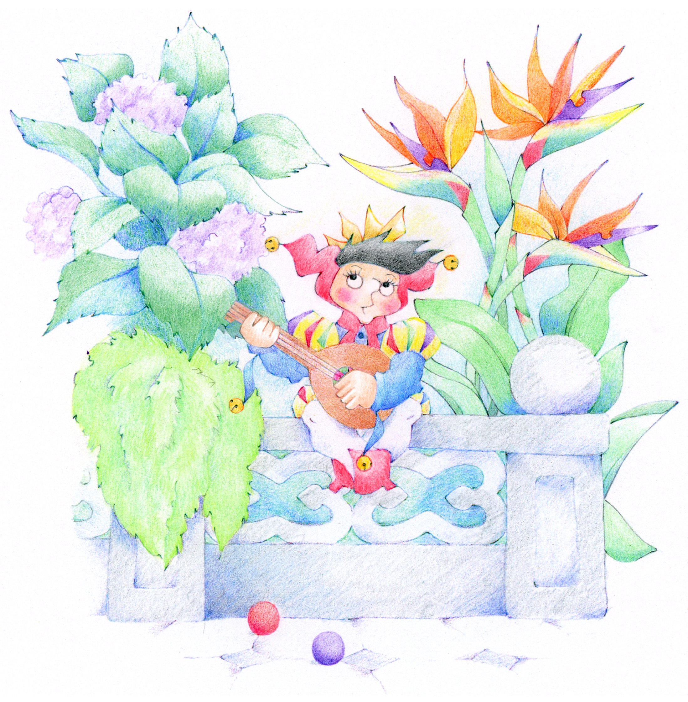
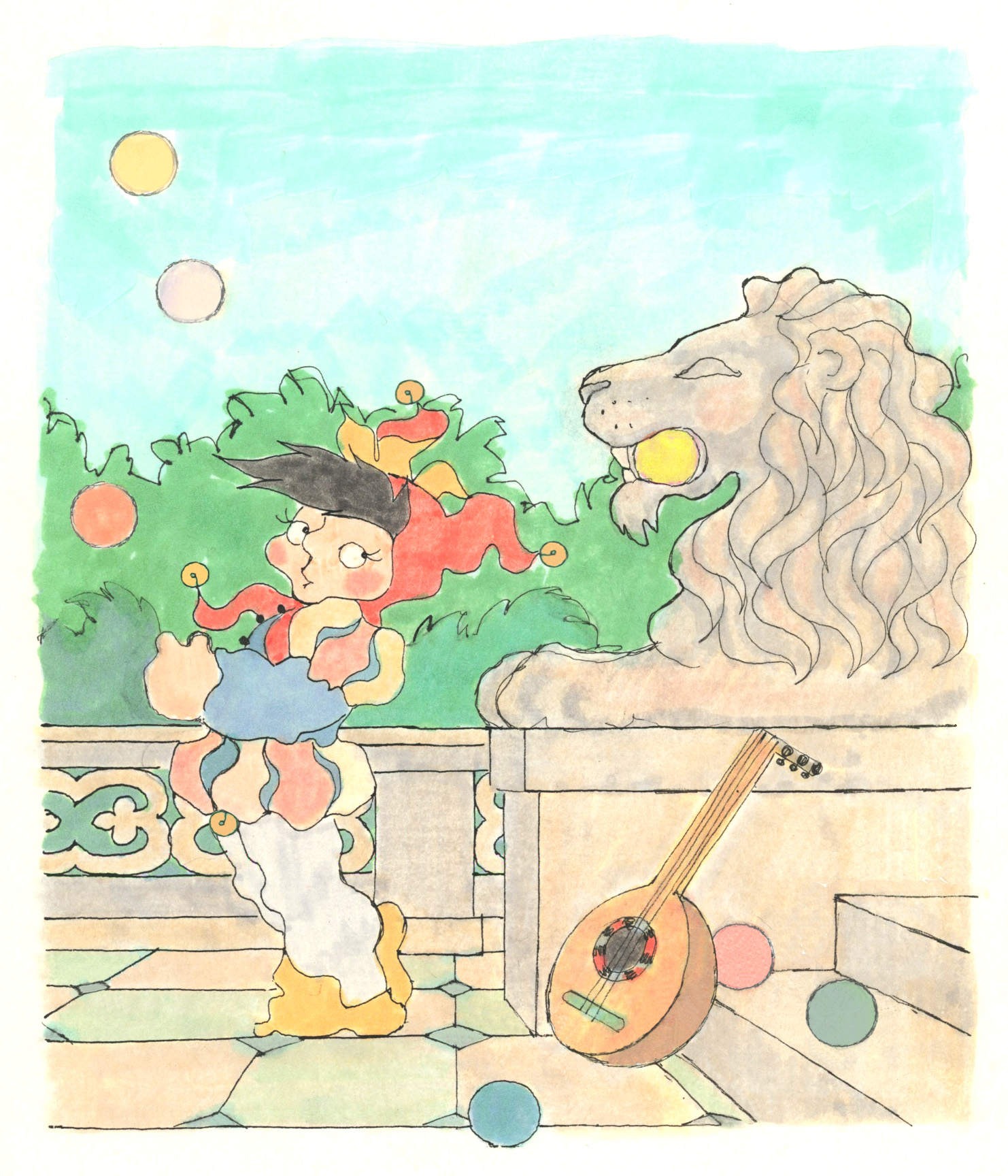
This is the first illustration of the little fool to appear in Sir Little Fool and the Skeptical Princess, my second children’s book. He came a long way in the two years I was teaching myself to be an illustrator. See below.
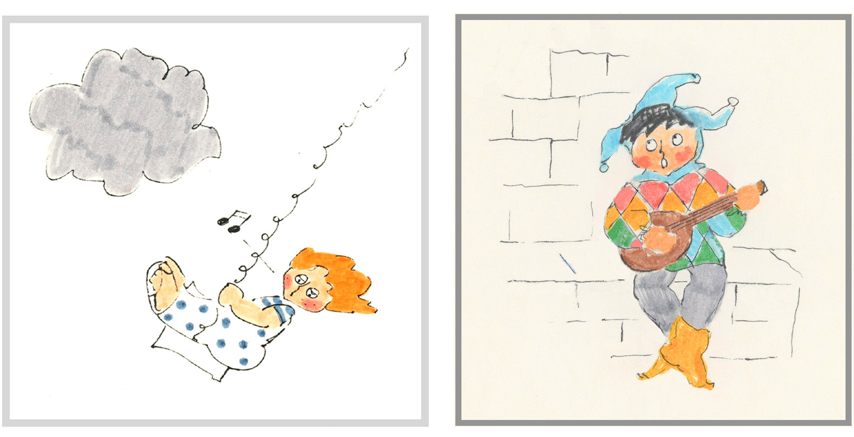
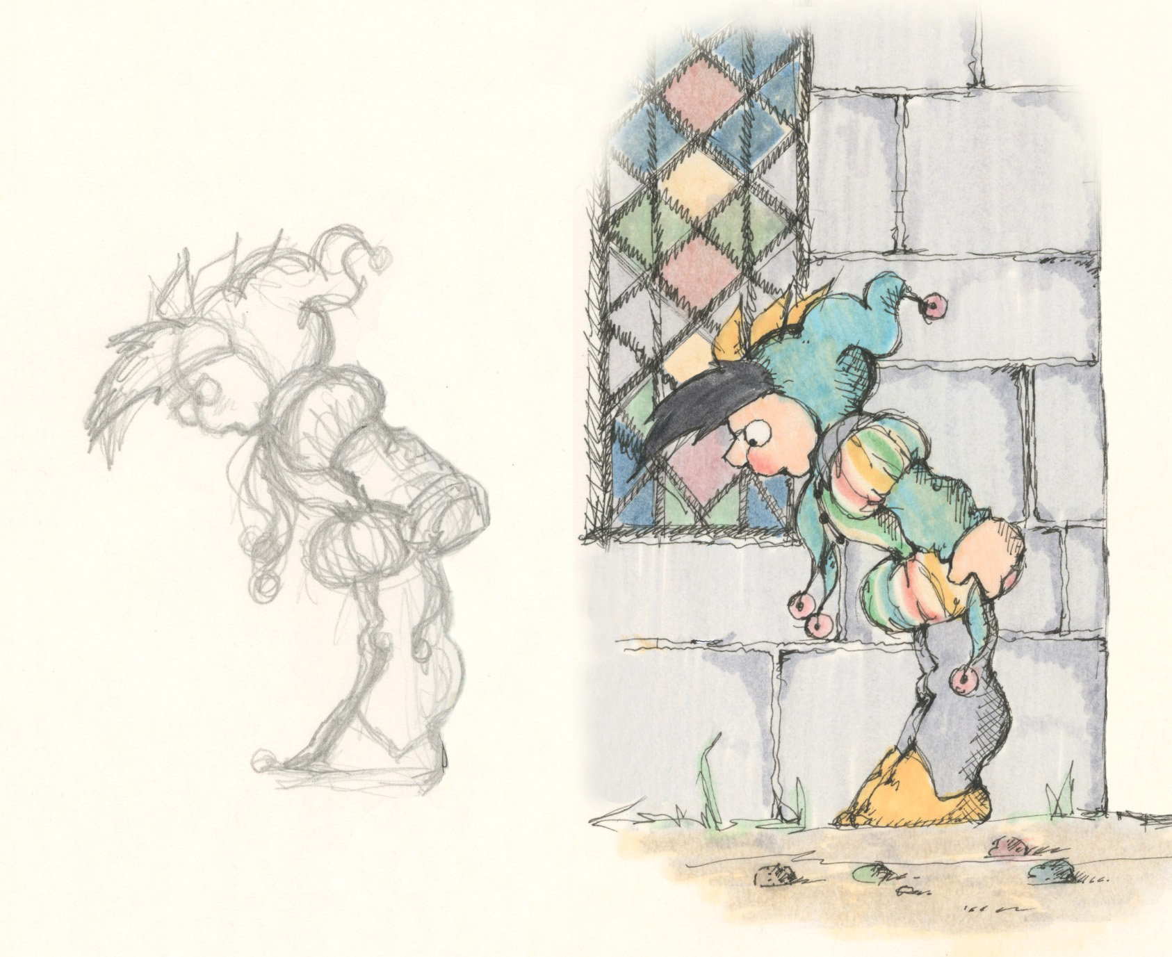
On the left is the opening illustration of Somebody Grab That Dog, my previous book; on the right is my initial drawing of the little fool, looking very much like my original protagonist—he was my starting point.
But what palette and what drawing tools should I choose, I wondered, for Sir Little Fool and the Skeptical Princess—a more ambitious undertaking? What did I want my fairy tale world to look like? Bright? Pastel? How detailed?
At Amsterdam Art, I discovered pastel markers that I tried out to get more subtlety in my colors—also, a rapidograph ink pen that, with the finest nib, allowed me to explore intricate textures.
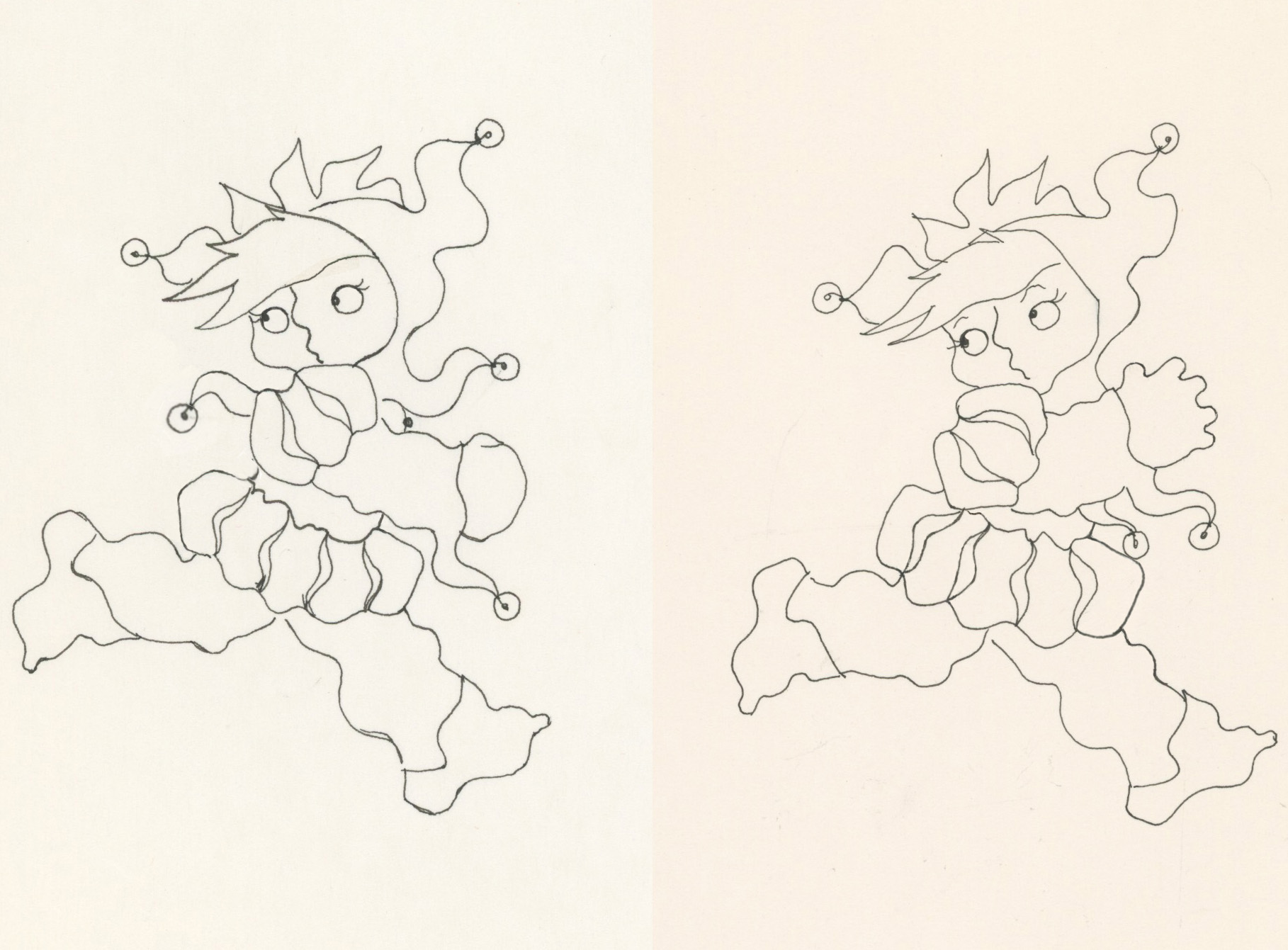
Soon my figures, unaccountably, became chunkier and more squat. I would trace them and try out a number of small variations in their poses before choosing the final one.
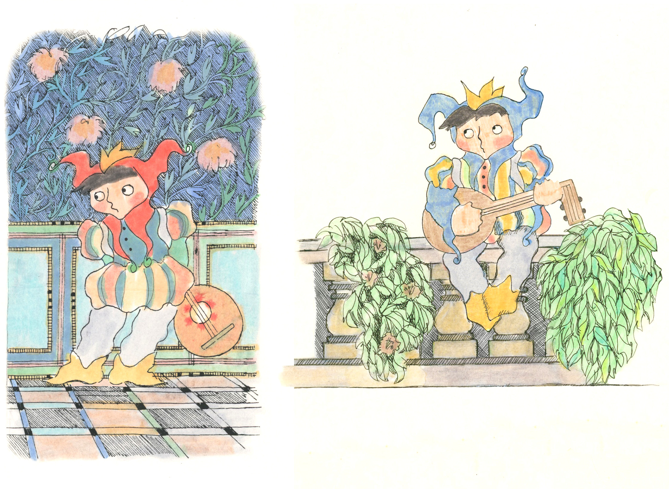
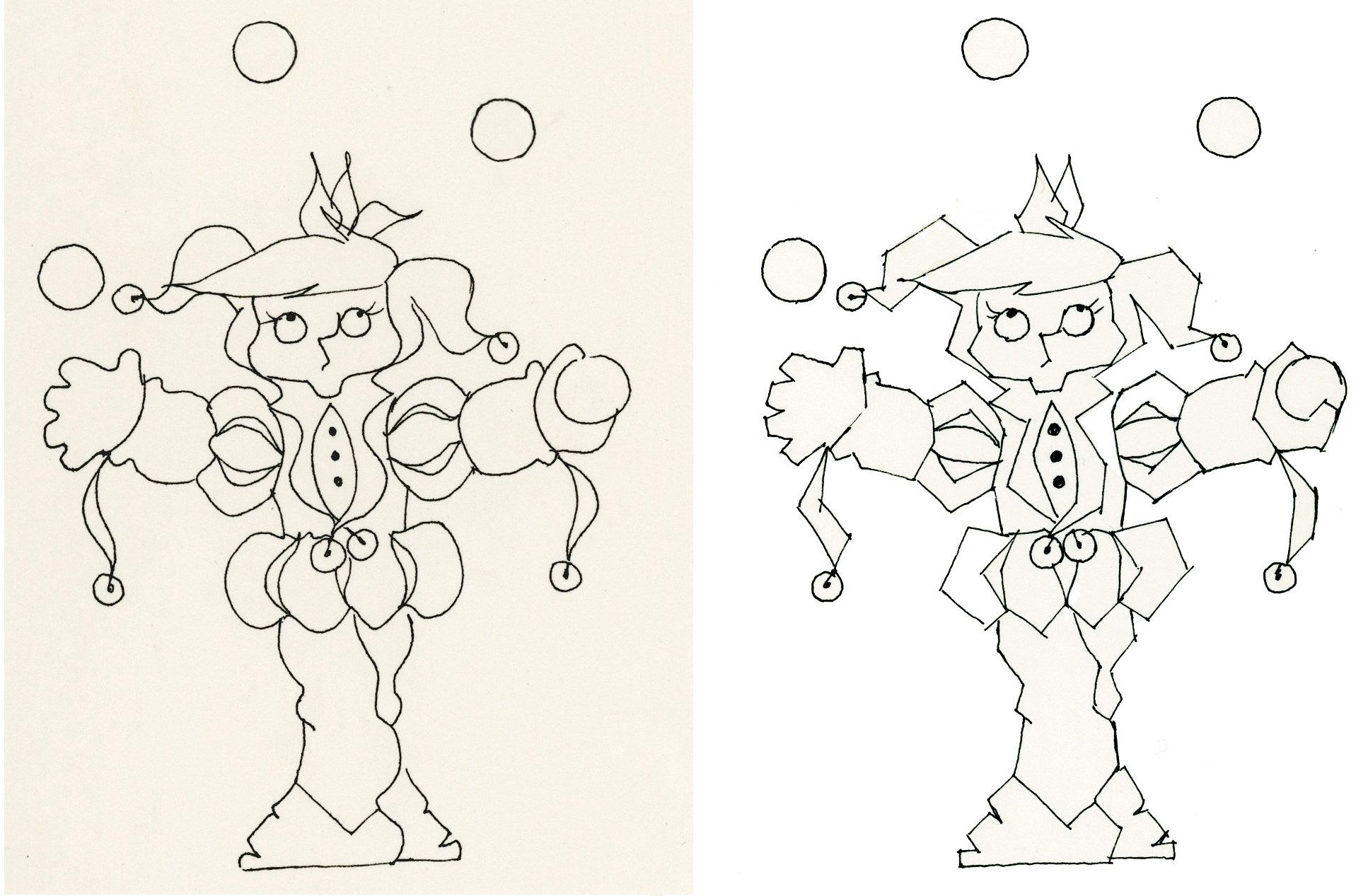
I call this my Sinuous Period, when my figures wavered, sometimes looking like they didn’t have skeletal structures.
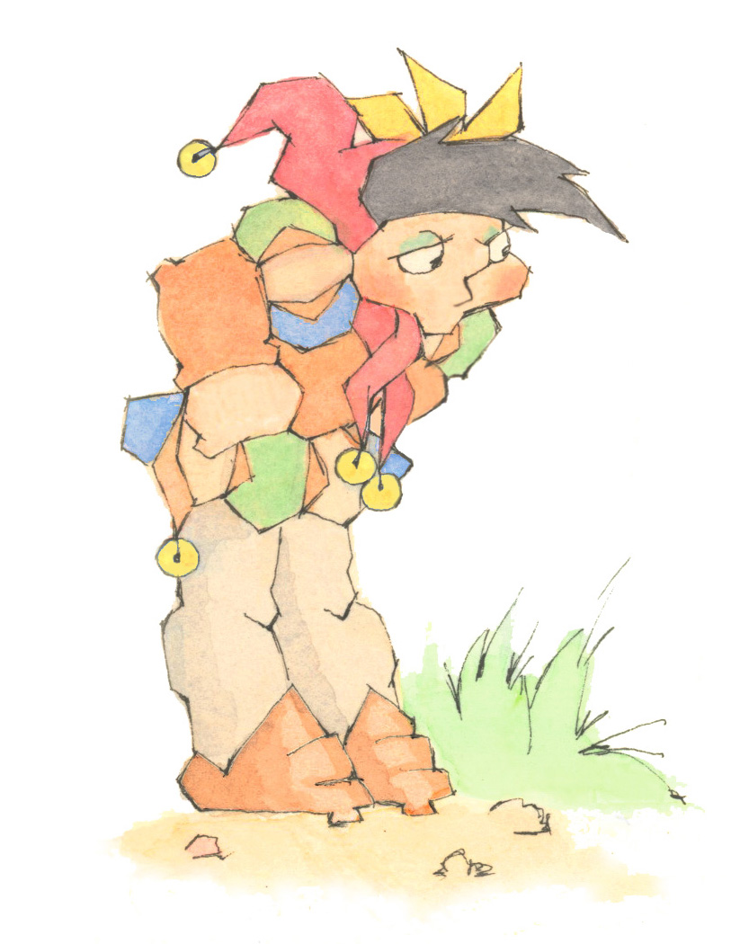
Next came my Bulbous Period when I began to draw round shapes to construct my figures. My first versions were spontaneous scribbles in regular pencil. But as I refined the illustration, I sometimes felt that it was losing too much of the energy and expressiveness of the original—and I went back to study it to see where I was going awry.
Then one morning I woke up and found myself in a quandary. Whereas before my compulsion was to draw curved lines, now I found I could only draw straight ones—which ushered in my Prickly Period when all my figures looked faceted.
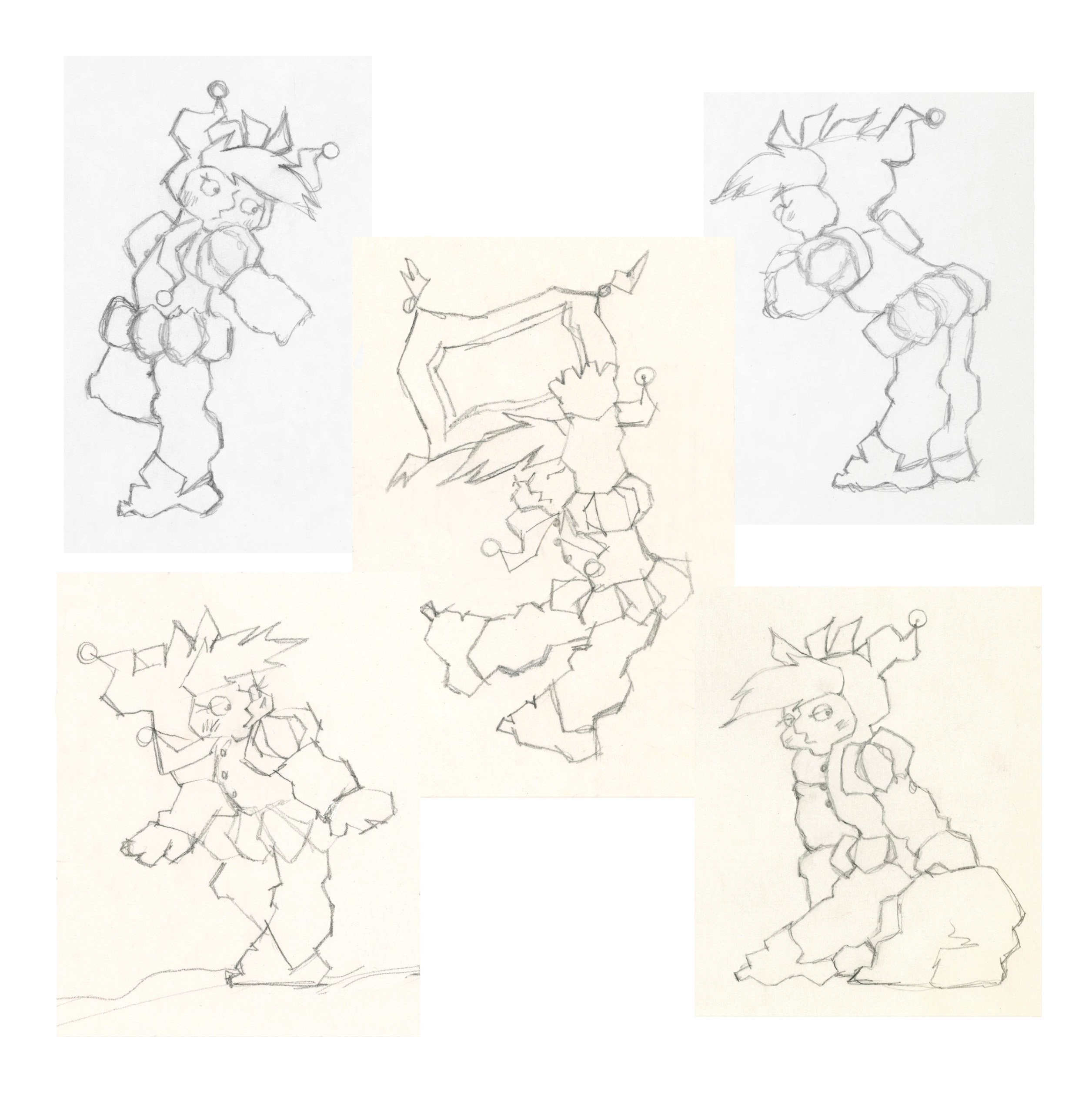
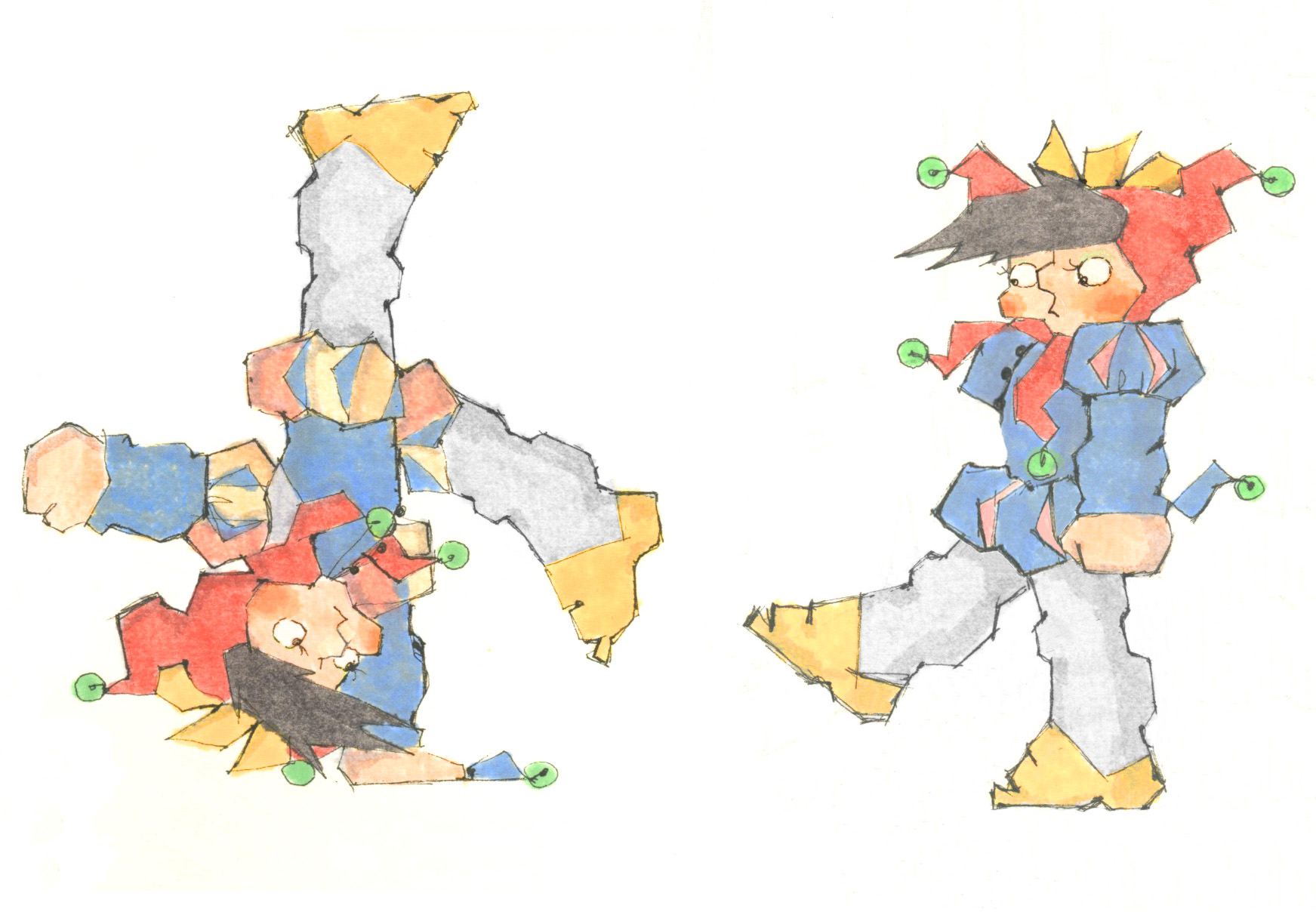
It was during my Prickly Period that I really got the hang of drawing the little fool.
The problem with markers, however, is that the backgrounds come out blotchy or ribbed, as you can see in my Sinuous Period. So I tried watercolor.
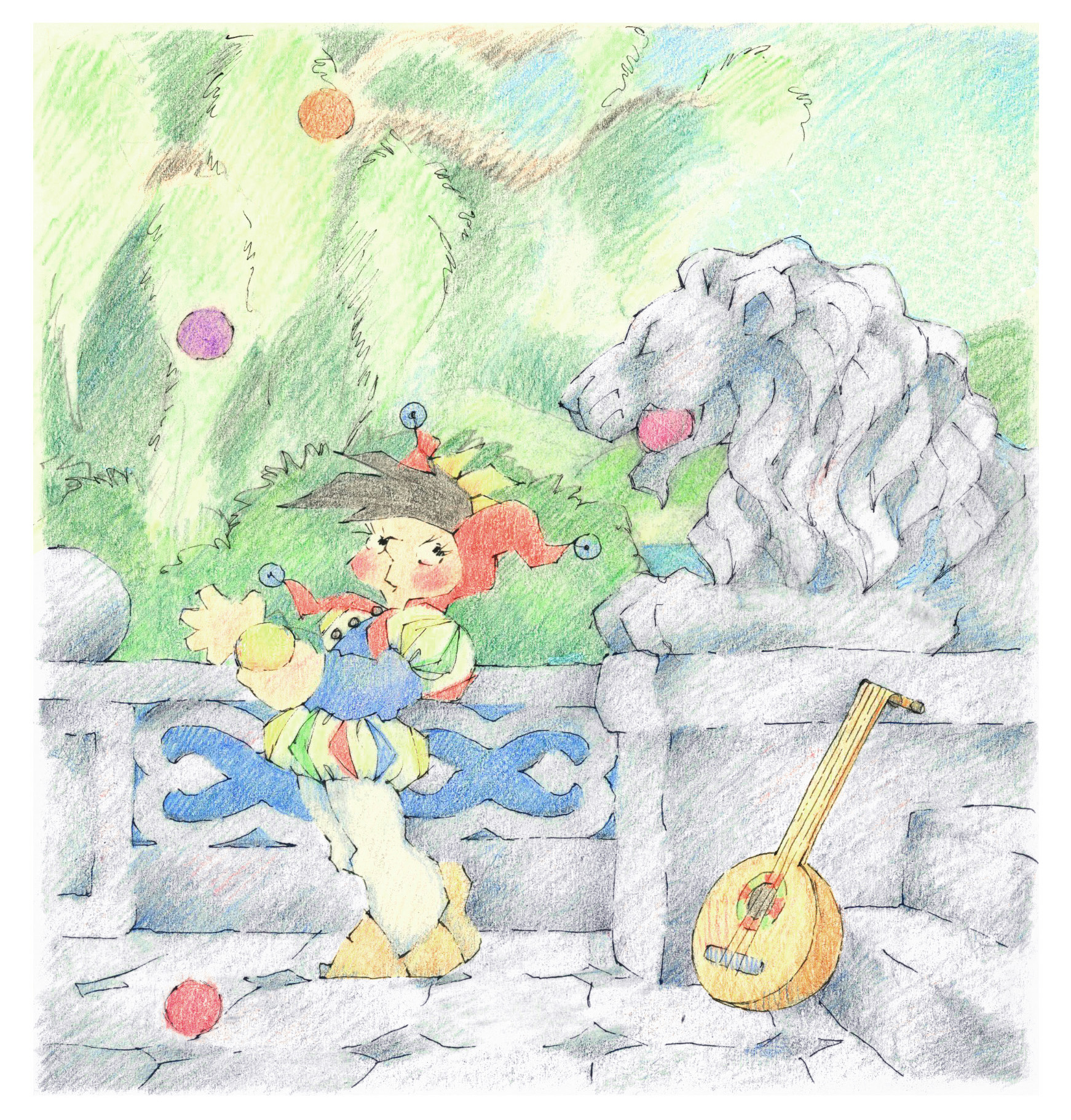
But I was unused to a brush and quickly shifted to colored pencil, both because I had better control—and because I could erase.
Only now I stumbled upon a new problem. Because I wanted the outlines to be as unobtrusive as possible, I continued to use my rapidograph pen, its nib about the diameter of a coarse hair. But trying to combine these two mediums proved foolhardy: Dust from the colored pencils kept clogging the nib, which then had to be replaced—and they weren’t cheap. Of course, I’d have the guy at the local art store try to unclog the nib first. Sometimes he’d succeed, but he was so klutzy, his efforts invariably resulted in some minor catastrophe, like the time he shook the pen and spattered permanent ink all over my favorite sweatshirt.
In the end I abandoned the pen and started doing the dark outlining in black colored pencil, though the dust from it smeared and muddied the nearby colors as my hand dragged over the image during drawing.
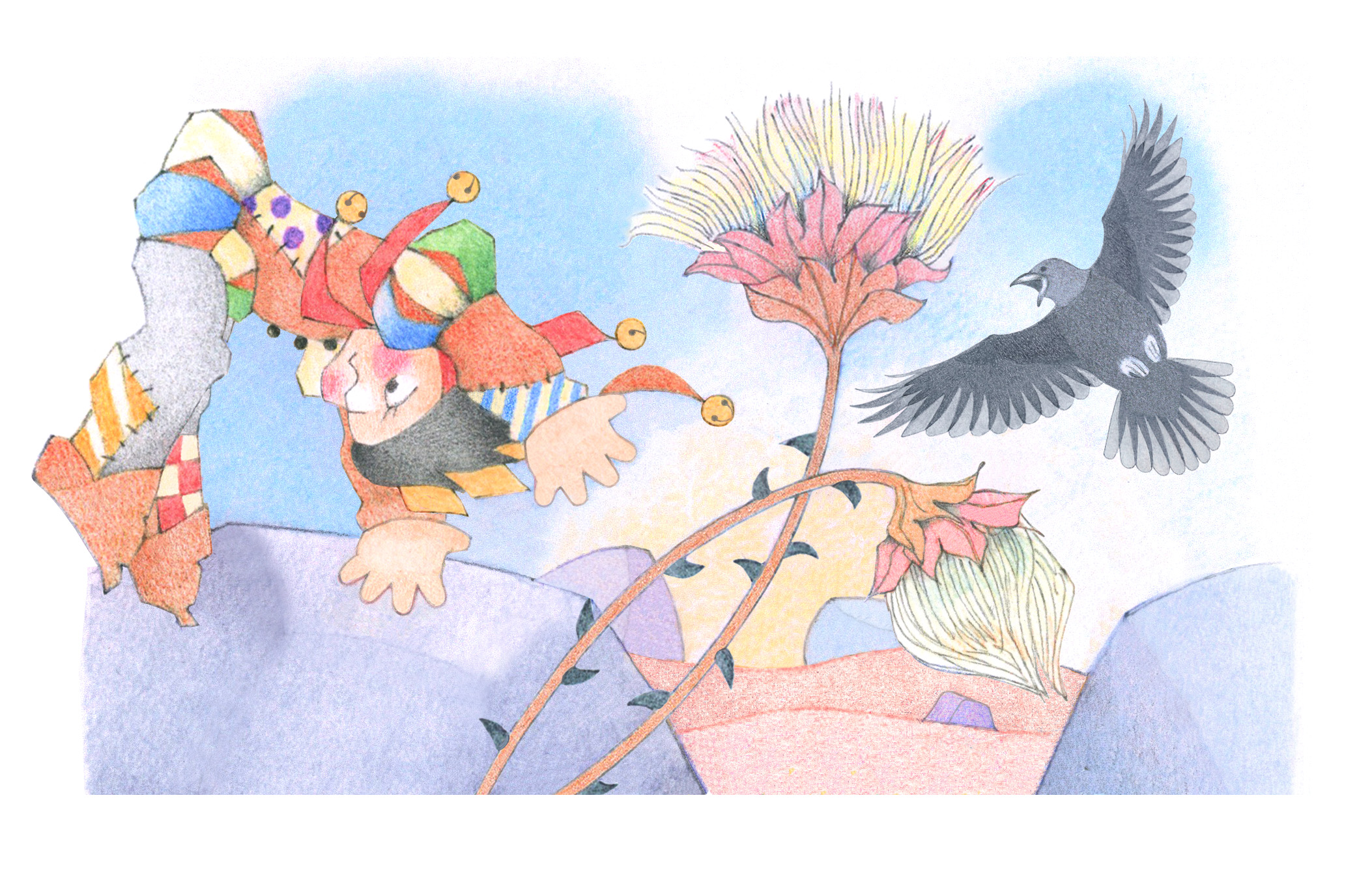
But now, all these years later, I can restore the clarity of the colors using various tools in Photoshop!